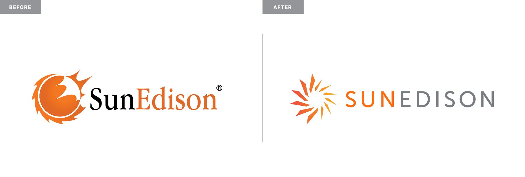
SUNEDISON
Before SunEdison’s epic Wall Street collapse, they came to us to refresh their brand for the 21st century ... a little too late IMHO. Nonetheless, we provided them a modern brand identity with a simple and smart logomark that better encompassed their full capabilities. The mark still represents SunEdison’s vast solar holdings, but now it also embodied the blades of wind and hydro power turbines. Paired with a more energetic pallet and modern typeface, this rebrand showcased their commitment to a world running on renewables. Now if only they would have known how to run a Fortune 500 company.